Upper Cumberland Shuttle’s New Van Wrap Turns Heads

Dimensional Wood Signs Welcome Home Buyers for The Jones Company
Rebranding can inject new life into your business, as well as bring new customers. The Music City Market, a convenience store located in Nashville’s Music City Central, experienced that first hand when they called us to make changes to their outdated window decals. For this project, we designed, printed and installed beautiful, new window graphics to create a more cohesive, professional look, as well as to provide UV protection and privacy. Let’s take a look at this store’s transformation!
To begin this project, we visited the market to see the older decals that had been on the windows for several years. We took measurements and talked with the manager and employees.
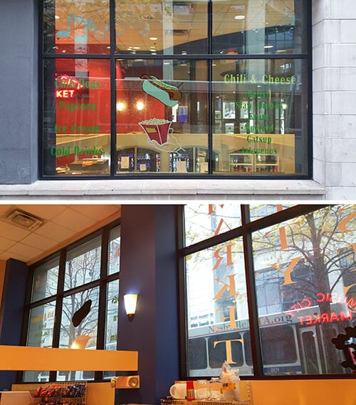 Here are two views of the old decals we removed from the Music City Market’s exterior glass. Just wait until you see the new window graphics!
They told us they needed the new window graphics to solve the following problems:
- They needed to rebrand. The old decals were outdated and just didn’t provide a cohesive, branded look. Our designer was asked to come up with a new professional logo and design to use throughout the store as well as on their marketing collateral.
- They needed glare protection. Employees were having difficulty seeing the point of sale monitors at certain times throughout the day, since the exterior windows are located behind (and slightly above) the monitors. Employees also needed additional shade from the sun.
- They needed privacy for their storage areas. They also needed the new window graphics to hide their stocked items and storage areas that don’t get a lot of attention.
In order to satisfy their requirements, we suggested they use perforated window vinyl for the windows that required privacy or UV protection. Perforated window vinyl appears opaque from the outside, but allows visibility from the inside. The perforated material has tiny holes in about 50% of the film, yet the graphics still maintain a rich, vivid look. Our contact at the market agreed with our suggestion.
To create the new Music City Market logo, our talented graphic designer used a skyline of Nashville, along with the words “Music City Market” in bold lettering. He placed the graphic elements inside a circle outline and used the colors blue, white and black.
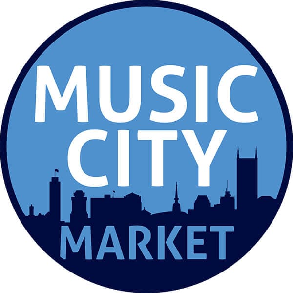 Our graphic designer created this beautiful Nashville-themed custom logo for the Music City Market.
He then designed the window graphics using the new logo. He created layouts using the perforated vinyl for the larger exterior windows, interior lobby windows and an interior door. He also created a design for the double doors at the main entrance to the market using white cut vinyl graphics. He placed his designs in a proof format, which gave our contact at the market an idea of what the graphics would look like after installation. As you can see, the custom artwork definitely had a “music city vibe!”
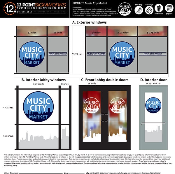 Our designer created this detailed proof to show how the new window graphics would look after installation.
Once he received a thumbs up on the proof, we printed the graphics on perforated vinyl using our wide format HP printer. For the vinyl that would be installed on exterior windows, we also applied a gloss “water-clear” finish laminate that will help slow down the UV fading process. Our team installed the new window graphics at the Music City Market.
And here’s the market’s new look! We installed full-coverage perforated vinyl to the exterior of the outside windows, which created perfect shading and UV protection for the employees and equipment inside. Nice new look, don’t you think?
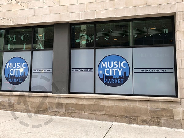 We installed these new window graphics on the exterior windows at the Music City Market. We love the new, more professional look! (The older decals were also removed.)
For the double doors leading into the market, we installed white cut vinyl in the shape of the new logo and city skyline. This allows customers to still see through the double doors, while also providing nice branding. The logo was placed on the top half of the glass doors and the Nashville skyline on the bottom. We also installed perforated privacy vinyl on the side windows to the right of the doors to cover the storage area behind the beverage machines.
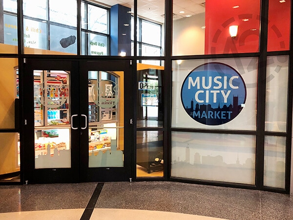 This is the view from the lobby looking into the market. The new window graphics make a great first impression!
For the interior door leading into the storage area in the back of the store, we installed more full-coverage perforated vinyl.
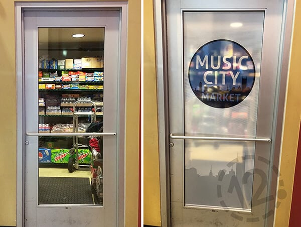 Check out these before and after images! The new perforated window graphics on this door allow privacy and provide a branded look for the storage area.
This fun project was a great example of how rebranding can help a business change its entire look with just a little professional design work and new custom graphics. We believe the change was well worth the time, effort and money! Current customers will quickly notice and appreciate the changes, and new customers will want to find out what this great market offers.
Does your business need help with rebranding or custom window graphics? We can help! We specialize in all types of custom signage, including exterior and interior signage and lobby & logo signs. We also specialize in branded environments, wall murals, architectural displays, advertising wraps, and custom projects. We’re located in Franklin, TN, but we serve all of Middle Tennessee, including Nashville, Brentwood, Murfreesboro, Spring Hill, Lebanon, Mt. Juliet, and Smyrna.
Give us a call at (615) 595-6564 or click on the button below to get your next project started today!
Music City Central (MCC), MTA’s downtown bus transit station, serves up to 20,000 passengers each weekday. Located next to the Municipal Auditorium and Nashville’s Central Business District, MCC contains space for all downtown transit operations, including space for buses and passengers, climate-controlled waiting rooms, restrooms and small retail businesses. For more information about the Nashville Metropolitan Transit Authority, visit this website.


